If you already have a website but it seems pretty flat, lying somewhere gathering dust because you couldn’t be bothered, or didn’t know how, to update your website or implement SEO best practices, refresh your website now.
Every moment you pass without updating the content on your site, you lose valuable customers who could help you reach your bottom line and generate more revenue for your business operations. One of the key elements of a great website is its design.
Top brands such as Nike, Coca-Cola, Shopify, Uber, Airbnb and Virgin all know the importance of great web design.
Online competition for a customer’s attention has intensified. In the online space where you’re contending with hundreds, if not thousands, of brands to get your visitor’s attention, you will need an irresistible offer and an excellent website experience to compel them to take action.
We’ll be sharing examples of great web design from top global brands and fleshing out key lessons you can implement on your own website for business success.
Create a website that is easily consumable (FreshBooks)
You may have heard about FreshBooks, the accounting software many small businesses use to help run their business. While there’s been a lot of debate on whether long or short homepages convert better, the fact remains that you need to be more careful with longer homepage copies.
FreshBooks’ homepage is really easy to understand. At first glance, you immediately see what they are about. Accounting software for small businesses who want an easier process. They offer a trial period where you can test run the program and a toll-free number to encourage users to call for further enquires.
They picked green as the colour of their call to action button and you’ll notice that it contrasts nicely with the rest of the content on the page. It is big, bold and clear for anyone to understand what happens when they click the button.
This is where the collaboration between web designer and digital copywriter shines most. One person is choosing colours, the other is writing highly-converting CTA readers respond to.
Consistent branding throughout the site (Apple)
Perhaps second only to Coca-Cola, Apple is one of the biggest brands that understand how website design can influence branding and have so leveraged it effectively. Top marketers who know their stuff understand that website branding directly impacts conversion.
With Apple, it’s not just the iconic logo but everything else on the website. Every word conveys its brand values. From its useful tools, gorgeous design and elegant look.
A few branding lessons you’ll learn from Apple are to make the headline and subheading as brief as possible. Keep it short, sweet and powerful. Use a beautiful product photo to highlight the copy created by a web content writer.
The logo should be visible but not overwhelming. When embarking on a web project, what story do you want to tell? Your writing tone and style should follow your beliefs, values and your target audience.
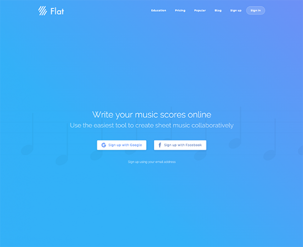
Use Negative Space (Flat.io and Google)
Whitespace and negative space mean the same thing. It is the empty space in between words. In web design, lots of white space makes it easy for users to understand and read text on your website. It immediately draws attention to the text and other elements of your site. Pay attention to all negative space between letters, paragraphs and spaces.
We love how Flat.io uses a massive amount of negative space to keep the reader’s attention on their major call to action. Sign up with Facebook or Google. Notice how they use tiny letters for signing up with email? It’s obvious they don’t want you to take that action but they offer if for those who don’t have social media accounts.
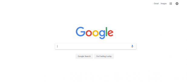
Another great example of maximising the power of whitespace is Google’s homepage. It is clutter-free, well-organised, neat and ensures the reader has a great browsing experience.
Make your content relatable with human faces
Using real people on your homepage and across your website makes it easier for the reader to empathise with your brand and feel a strong connection to it. When a visitor sees a face on your website they want to feel the same emotion. If the person is smiling, laughing or looking sad, they associate it with the experience they will get from your site. It’s a great way to build emotion into your website.
Ensure that you optimise the images on your site so that they don’t affect website loading speed. Any delay could hurt the conversion rate by up to 7% or more. Optimising images doesn’t affect their quality.
The F-Layout
Research has shown that online web browsers follow the F-Pattern. Readers see the top, upper left corner and, finally, the left side of the screen. They only look to the right in passing, not really taking note of what’s on that side of the screen. So, the most important elements such as your call-to-action, branding and navigation should all be on the left.
It works because users naturally scan content. It fits nicely with the pattern of reading from top to bottom and left to right, as we do in print content such as magazines and novels.
Use colour and contrast (Neil Patel Digital)
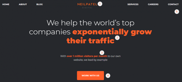
If there is an element you want to stand out from the rest of the content on the page, such as an offer you want users to convert on, use contrasts to highlight the offer. Neil Patel loves the colour orange. He uses it on his website NeilPatel.com and Neilpateldgital.com. He uses bold orange to highlight the words “exponentially grow their traffic”. This is his offering to prospects and customers.
He also uses the same colour to highlight the call to action button, the number of monthly visitors (over one million, many digital websites can only dream of such figures) and the logo.
Simplify your design (Dropbox)
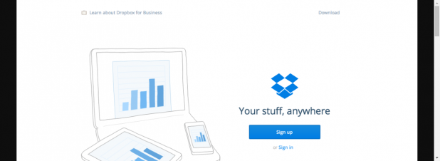
You’ve heard digital marketers and web designers all go on about the importance of simplistic design. You have probably also heard the quote “less is more with responsive web design.” Dropbox is one of the best examples of this. They embrace whitespace whilst limiting visuals and text.
When working on a web project like this, finding a copywriter that can communicate your message in a few words is crucial. Just like Dropbox’s copy, Your stuff, anywhere. Simple, yet powerful. The image of a laptop, mobile phone and tablet mean you can sync your files across all devices. The call to action, sign up, is easily visible and clear.
Individuals who want to download the app or learn more before taking further action could use the buttons at the top of the page.
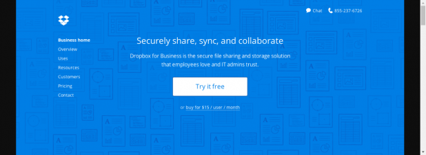
When you click to learn more, Dropbox tells you everything you need to know about their service in one sentence. Share, sync and collaborate with employees and admin.
Use a clear call-to-action
An obvious mistake many websites make is expecting the reader to know what to do next. Your call to action directs the visitor towards a specific action you want them to take. Think of it like an indicator on the side of the road telling you to go left or right.
You’ve engaged the reader with your awesome new website content. Guide them to the next action and tell them what you want them to do. It increases your chances of getting new customers and increasing conversion rates consistently.
Use great product images (Nike)
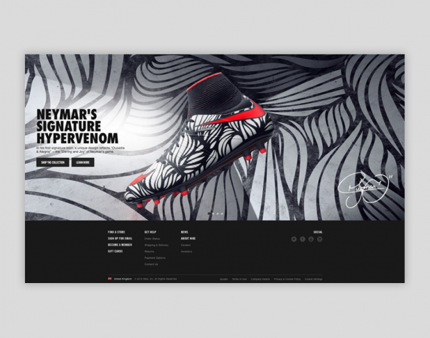
Nike is one of the biggest brands in the world. The design is integral to the brand as they rely on attractive products and seductive SEO copywriting that compel visitors to make a purchase. Your memorable browsing experience begins on the homepage where you’ll notice amazing graphics dominated by a standout new product image and complemented with amazing copywriting. Their content marketing strategy is flawless.
The former images on their homepage feature Neymar’s signature hyper venom. New images include running shoes, back to school essentials and a few products accompanied with copywriting.
They use free-flowing shapes, neutral colours and simple text to ensure that the image is the centre of attraction. The weathered background better highlights the quality of the shoes, making it look cleaner and more attractive. Everything else on the page blurs so that your focus on is on the shoe and the call to action Shop the collection.
Use social proofs
Social proof is one of the basic elements of the psychology of persuasion. It is the best way to convince doubters that your product works. Buyers trust other buyers. This is why reviews are a major determinant for the success of your online business.
Working with a content writer, you can interview a happy customer who has used your product or service. Top it up with measurable results.
For instance, if you have worked with a web design firm or copywriting agency you could say how their work increased conversion on your website by 57%. If you sold a weight loss pill or diet plan, the customer could state exactly how much weight they had lost after a month. Use pictures and their full names so people know it’s not made up.
Conclusion
Consider the points we’ve outlined in this article as inspiration to improve your website design. A/B test everything and work with a content creator to ensure that design and text generate leads and grow your business.