Beautiful web design is in shockingly low supply. Designs that intrigue and inspire us are few and far between. In fact, only about 11% of websites are optimized for responsiveness, despite the fact that, according to Adobe, 73% of users will stop interacting with your content if it is unoptimized. Why, for something as important as your online presence, would you neglect design, especially when users have such high expectations?
Web design cannot be an afterthought for any organization. Too often churches and other nonprofit organizations rely on their mission to relay their message, instead of leveraging the power of visual design, pleasing copy and responsive images.
Increasing the meaningful engagement your site receives requires a rigorous study of effective web design. These designs are not only functional but inspirational; they entice the user with symbols of hope, perseverance, and kindness. Gleaning from their wisdom will assist in your endeavor to create a website tailored to your audience.
Here are 5 inspirational web designs for churches:

1. Terra Nova Church
Terra Nova Church’s website is somewhat of an anomaly, one that might prove useful to those with minimal designs in mind.
A subtle geometric design overlays the rich purple background. A burnt orange gently complements the fabric-like design. Short, stylistic headings and subheadings pepper the homepage. You’re guided mostly by symbols, a site directory appears halfway down the page, unobtrusively, then the page ends with a muted, restrained footer. The design appears markedly modern and polished.
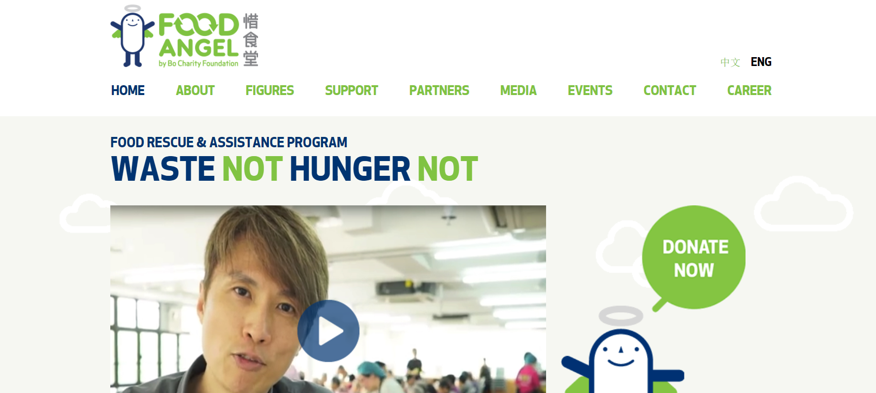
2. Food Angel
Food angel is a food assistance program located in Hong Kong, but you need no context to understand what it is that the organization does. You need only to glance at their homepage. It uses succinct, attention-grabbing copy and cute imagery to tell its story.
The purpose of the organization is immediately apparent because of the bold typeface and simple symbols it employs, which are complemented by its concise content. Further down the homepage, Food Angel uses panels to organize their content cleanly while continuing to employ ample white space.
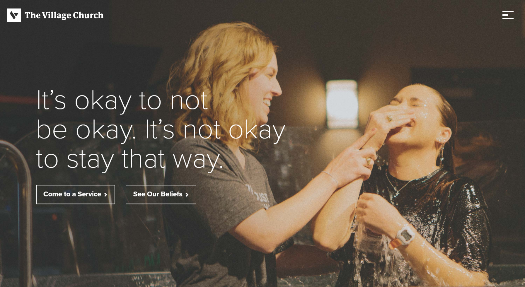
3. The Village Church
The Village Church is a simple, clean design featuring real people. Immediately upon loading the site, your screen is filled with a candid shot of a baptism. “It’s okay to not be okay,” hovers over the image, inspiring hope and self-forgiveness from the visitor.
Eschewing the pomp and circumstance often associated with churches, the design gives a relaxed, approachable feel and a sleek look. Further, studies have shown that images of real people, as opposed to models, attract users more often and more powerfully.
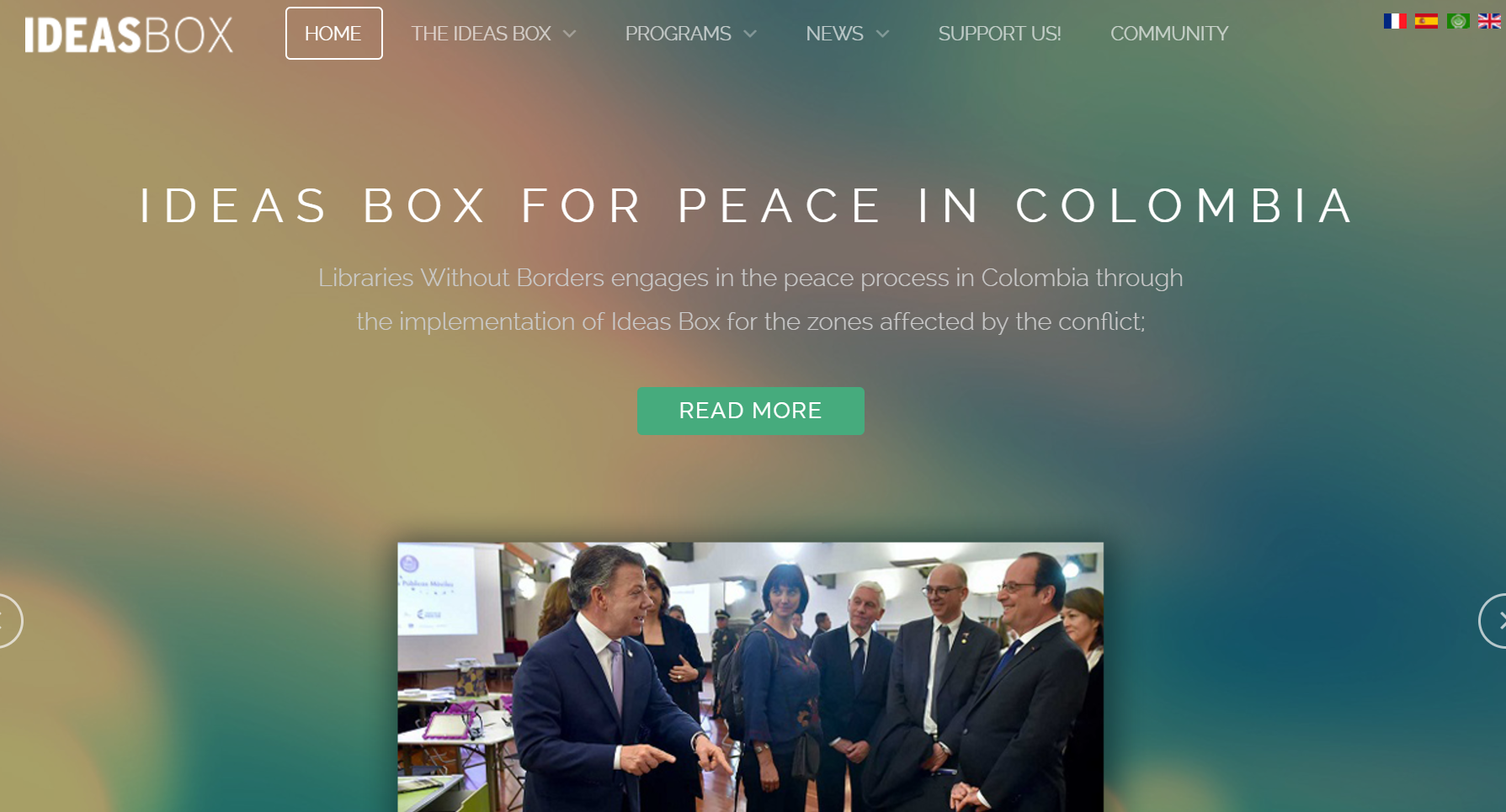
4. IdeasBox
IdeasBox is packed with information, but it’s so lovingly doled out that it is simple for the reader to digest. It truly has a beautiful web design.
Replete with images, videos, and other content, it never loses the bold, colorful beauty in the site’s header. The nonprofit finds a way to keep the visitor intrigued, with loads of content, without ever giving way to disarray or disorganization.
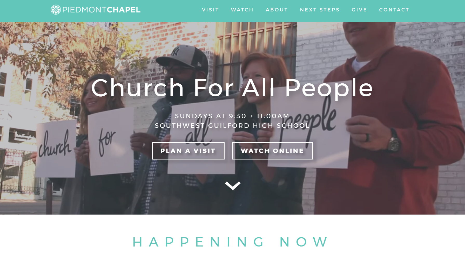
5. Piedmont Chapel
Piedmont Chapel is another example of a spectacular use of header space. Their header features a video of a friendly bunch huddled together preparing to take a group photo, talking amongst themselves and laughing.
An overlay reads, “Church For All People.” Two buttons are stationed beneath, one reads, “Plan A Visit,” the other “Watch Online.” Instantly, the Piedmont Chapel achieves a feeling of friendliness, openness, and charm. Additionally, they supply the user with immediately actionable items.
Conclusion
There are plenty of web design trends to follow to better your own website. Larger images, clean, white space, and bold, easy-to-read typeface are commonplace in almost every example of exemplary web design.
It’s also important to keep in mind that the perception of your organization is affected by the tone of your site. The tone is created through an amalgam of visual decisions, from the colors you choose to use, the composition of the images you feature, to fonts you emblazon across them.
By and large, church websites should feel welcoming and warm. Blues, light yellows, and other pastels are often becoming, but which colors, symbols, and photos you use are entirely dependent on the specific message you wish to convey. The 5 examples above serve as a jumping off point, but the minutia is up to you.
There are plenty of affordable options available to those willing to put in the work. You may want to consult a professional designer or illustrator if you have the money to spend. Even if you’re low on capital, virtually everyone whether, budgeting consultant, expert accountant or adept marketer, would recommend some sort of investment into your online presence.
Be sure to research, test and refine your designs with church members and newcomers alike. Soon enough, you should have an inspiring website yourself.