Apple is renowned as a leader in technology; everyone has heard about this brand and can easily identify it amongst many others. That iconic apple is familiar even to people who might not know much about technology which just goes to demonstrate the power of good design.
No matter what your opinion of Apple products might be, we can all agree that Steve Jobs and Jonathan Ive are geniuses when it comes to marketing and branding. Their excellent eye for detail and focus on intuitive simplicity proves it.
Their products are now renowned for both their pleasing appearance and their ease of use, and are perfect examples of the benefits that come with minimalist design. Choosing simplicity in design makes products appear more high-end and modern, something that many companies nowadays are eager to adopt for their own branding.
How do you do it?
Planning a website
Get started by thinking about what your goal is: what do you want to get across to consumers?
Then, review your current website design while asking yourself if it’s currently contributing to that goal. If there is something that doesn’t look right, don’t be afraid to just remove it. Eliminate anything that doesn’t match with the clear, defined and focused design you aspire to achieve. None of the elements on your site should be there just to occupy space. Everything there must have earned its place and have a reason to stay.
We’re not just talking about the homepage. Every single section on your site or app has to be there with a defined purpose. If you feel like one of the images or captions add nothing to the site, then simply remove it. Keep thinking about simplicity and how much better your website will look once it’s free from all the unnecessary additions. Your visitors will be more inclined to come back to a site that appears simple and clean, easy to access and navigate within.
Imagery
Nothing disappoints more than clicking on a website and being welcomed by pixelated low-quality images. Your immediate instinct would probably be to leave the page and never come back. The absence of high-quality imagery shows a lack of care in building the site. How can someone trust a company that won’t spend enough time to ensure their site’s images look good? It gives off an illegitimate vibe.
Focusing on only using great images at a good resolution will instead communicate that your business is credible and professional. It shows that you take care of the way your company appears online and have put some effort and time into your brand and website.
If you don’t have experience with photography, or if your current images simply don’t look particularly good, you can use sites such as Unsplash and Pexel. They provide high-quality, royalty-free, clean and minimal stock photos that are both original and interesting.
Typography
Often overlooked, typography is just as important as the other website segments addressed above. Think about this carefully. You need to find the right typefaces that suit your company, are readable and offer something unique to make your brand more noticeable. A potential customer might judge your brand as good or bad just based on your font choice.
Thin fonts give you a modern look, while regular or bold ones could appeal more to mass market brands. For example, if you use Serif fonts, then you position yourself as more antique or editorial, while sans-serif gives more of a modern vibe. Keep your target audience in mind when you’re about to choose because the font you pick needs to reflect what you want to say and what you offer.
If you are stuck for ideas, try using Google Fonts. It provides you with a large variety of fonts that you can both choose from and easily implement into your site.
Colours
Last but not least, colour plays an important role for any website. A specific combination of colours is capable of setting the tone for an audience. If the colour scheme you choose doesn’t work well with the product or service you are selling, then you risk giving off the wrong vibe. Usually, blue instills trust, black adds a luxurious feeling, while white is often associated with the feeling of purity.
If you still can’t make your mind up about colours, you can use this Colour Triangle tool to get a better idea of which colours work well together and which don’t. You might also find it helpful to look into the psychology of colour.
The Apple Treatment
Now let’s get creative and apply it to other brands and just to really drive home our point that a minimalist design can turn any brand into a high-end looking one, we’ll use companies which typically aren’t seen as so high-brow. Take, for example, these very different presentations of a Tetley tea box:
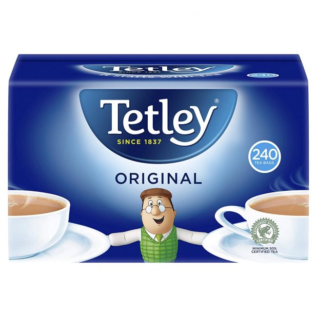
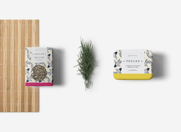
Since the 1920’s, food companies have used the strategy of displaying their products on the packaging to capture attention. Which one of the two products draws the eye? The one on the right probably resonates the most. It all comes down to good branding. The box on the left is an example of “telling instead of showing”.
We worked on this design with the idea of making the Tetley brand appeal to a more sophisticated market. We made the different flavoured products easy to recognise with the coloured strips, which also help to give off a sense of taste. To tie in the origins of the tea, we used a Japanese print, favouring earthy tones for the rest of the packaging, due to the natural element of the product. Ultimately, the Serif font we chose gives off a feeling of ‘prestige’ and ‘heritage’ which contributes to the sophistication of the branding.
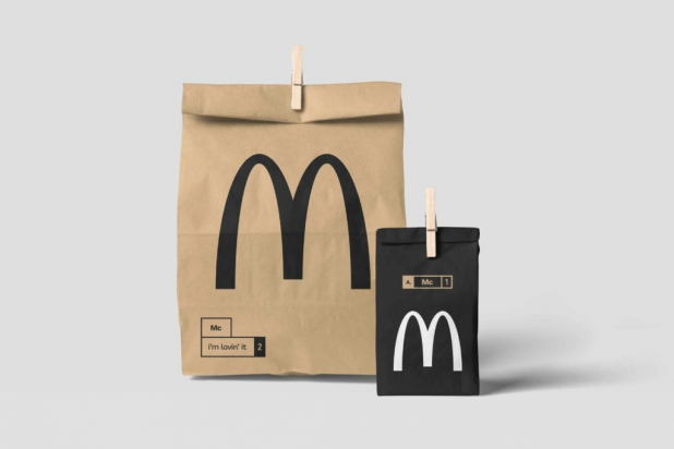
Our goal with this was to have the McDonalds brand look similar to an independent coffee shop from a trendy part of London. To do so, we gave it a more mature look utilising a black and white version of the logo, and adding boxes for a more consistent visual identity. We then made it more sophisticated with the wooden pegs, which are also useful to prevent the bag from opening. For the font, we used one that appeals to a mass market while staying minimal, and as such we went for Sans serif, which also gives off a youthful vibe.
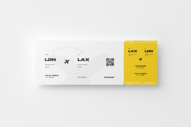
When we got started with the design for Ryanair, we knew that our focus was going to be on removing all negative connotations with flying low-budget. That’s why we made the brand colours more vibrant, with the intent of appealing to a younger audience. To help passengers find all the important information, we ditched the crowded and hard to read style of most airline tickets, and replaced it with a hierarchy of different typefaces. We also included the return ticket on the same pass to avoid having to carry around different tickets on different papers.
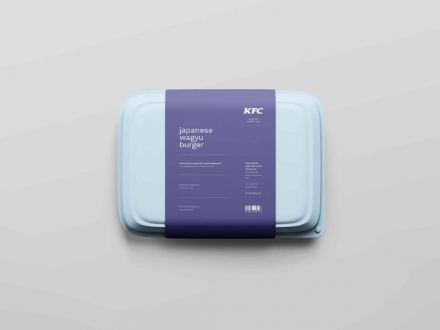
For KFC, we wanted to reinforce the idea that the meat in this product is top-tier. We removed the red usually associated with this company and, instead, chose some more subtle blue tones. We wanted to replace that feeling of urgency given off by the red with colours that let people know they can enjoy their meal without rushing and without feeling like it’s fast food. Additionally, the light sans serif font gives off a feeling of cleanliness, letting the rest of the packaging do the talking.
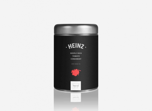
We approached the design of this Heinz product with the intention of giving it a feeling of sophistication. As such, we got rid of the plastic which makes the product look cheaper and implemented a chrome and metallic feel. The small visual cue informs people what the product is about while still keeping it minimal. The rest of the design stays neutral, using a bold Sans Serif font to both highlight the red splash and make it easy to read.
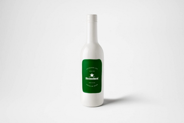
Our aim with this Heineken concept was to make this product stand out from the many other beers that usually tend to look very similar to each other. We opted for the white because it perfectly highlights Heineken’s trademark green, keeping the latter similar to a ‘stamp of approval’ to reinforce the top quality of this product. We kept the original typeface used by this company, while combining it with a Sans serif font that gives off a sense of hierarchy while also appealing to younger beer-drinkers.
Minimal design is quite clever in the benefits it brings, and for all our projects at Heue Digital we tend to follow this style. It adds value to what you offer and it helps people recognise you among many other competitors in the same industry. The consumer will be inclined to spend more for a company that looks professional, attractive and modern over one with poor branding.