At Purrweb, when discussing the design trends with my colleagues, we can easily be divided into 2 groups: trend followers (“Did you see the latest Google/Apple presentation and the new updates of their products’ UI?”, “Oh, new Facebook logo is so fancy”) and trend haters (“How can you even use Instagram stories? I spent 5 minutes finding the button”, “God, with this size of the screen I can’t get to the menu button and the new email button with the same finger”). However, I rarely find indifferent web/mobile app users – we use tons of apps and following trends means shortening the learning curve to provide intuitive user experience.
But, what about other famous brands? For example, Netflix is trying to study every customer’s preferences and offer the most appropriate UI/UX solutions. MailСhimp works hard on improving and extending the onboarding processes. And Lyft has run cumbersome A/B tests aiming to facilitate the interaction with their app.
So, even though there are hundreds of design concepts known, we will highlight a few of those that we think are worth checking.
Focus on the content
In 2019, content is King. And this trend is actually complemented by two minor trends. First of all, designers start paying attention to not only fonts but the words these fonts are applied to. It is crucial to maintain the voice of your business nowadays. Companies can’t just overwhelm users with poorly written text full of industry-specific terms that the customers might not even know.
Therefore, content is becoming more reader-friendly and understandable. Texts get simpler and shorter – no one has the extra time to read through tens of paragraphs.
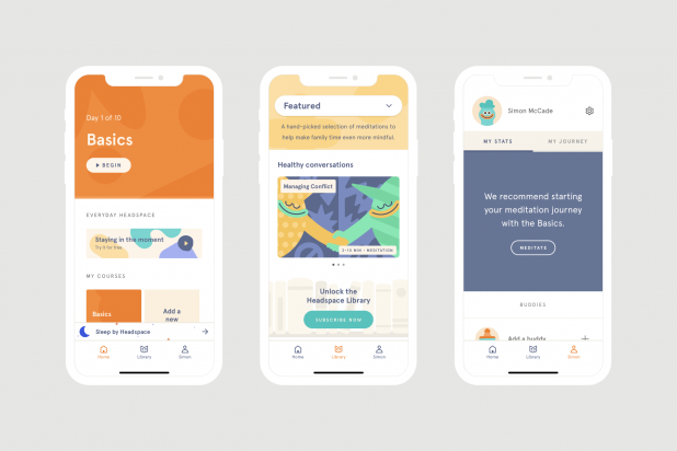
Take a look at Headspace as an example of the accurate combination of content and design that is easy to access and consume. The content consists of short philosophical quotes, tips, recommendations and practices to maintain health, some app-related suggestions, and audio content. Breaking down the content into short sentences contributes to smooth reading. While images of cartoon-like characters provide the user with eye-catching visuals. This goes in line with personalized content and provides value for every customer, enhancing their user experience. Thus, through well-structured content and personalization, the app has managed to reach more than 31 million downloads.
Also, the designers try to encourage users in reading and thus, make the content easy to reach. That’s why the navigation is straightforward and all unnecessary buttons have been removed. This brings us to the next trend.
Micro-interactions
These are tiny details that bring life to the interface and help the user understand how to work with it. Micro-interactions can make the user experience more engaging and entertaining. Additionally, they show customers that the developer cares about them, making the interface more understandable.
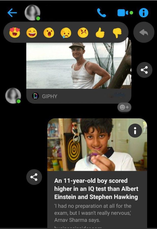
A great example of an entertaining micro-interaction is the ability to choose the size of the emoji you send in Facebook’s Messenger. This seemingly useless detail adds playfulness to the process and makes the chat more emotional.
Micro-interactions also come in handy if the designer works on a content-focused interface. For example, designers can use small animations instead of buttons to give the user a cue that they can swipe the page, or drag and drop files. Micro-interactions can predict the actions of users to make their experience smooth.
Motion design

Modern motion design is purposeful and plays a significant role in UX. Long gone are the days when animated objects were added just for fun. Today, animation must have a purpose and be useful.
It can serve as a hint on how to interact with the interface, make the whole experience pleasant and consistent, and, of course, engage customers into using the product. Hence, we now see interface objects and actions get a bit of motion design. Even brand logos become animated to drive user engagement.
3D and material design
People no longer enjoy flat and minimalist design and we now see vibrant colors and volume in user interfaces. Material design is more emotional and easy to adopt for designers since it follows clear and defined rules. Basically, it aims at making the interface hierarchical, meaningful and immersive by means of grids, spaces, scale, and motion.
Another cool trend is the use of 3D rendering and CG augmentation. Previously, designers avoided these tools because they require many resources, and even one 3D object in the interface could significantly slow down performance.
But today we have more powerful technologies at our disposal that make 3D rendering possible. Complementing the purposeful motion design, 3D objects can become a powerful tool that will improve the interface’s quality and engagement.
Variable fonts
Fonts were always static so it was challenging for designers to fit them into different screens. Variable fonts have made typography adaptive and responsive. This is an emerging technology that has already become a go-to solution among designers.
Of course, there aren’t many variable fonts yet, but we can anticipate multiple variations to appear in 2019.
Voice commands
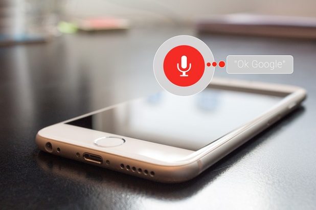
Nowadays, the design doesn’t have to be visible. And voice user interfaces prove this statement. Siri and Alexa are a few bright examples of voice-based solutions. However, people are not used to this way of interaction yet, that’s why designers make the voice command feature optional.
Another challenge voice interaction technology faces is natural language processing. Developers put lots of effort in advancing artificial intelligence algorithms, and they seem to be succeeding. Still, to make user interaction with the voice interface seamless and frustration-free, the experts need to design a dialog flow based on specific keywords, phrases and voice command patterns.
Inclusiveness and awareness

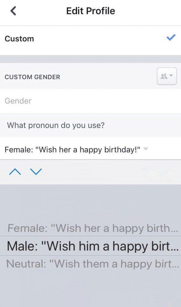
Today, interfaces offer more genders to choose from while creating an account and blur the difference between sexes, races, orientations, and so on. Also, developers create features that make the interface more convenient for disabled people.
Moreover, companies let customers have more control over their interaction with the product now. For instance, an e-commerce store can offer users to have their purchase delivered without the package. Or, take Uber, for example – clients can choose Uber Green if they want an electric car to pick them up. Thus, the customer can use the product while still taking care of the environment.
Switch to Figma
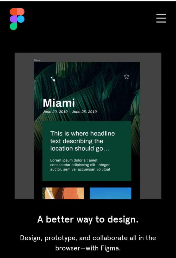
There are more things designers need to consider and tasks they have to solve as technology evolves. And instead of using multiple tools to get everything together, they can switch to Figma. This tool improves every single detail in the design process: speed, costs, teamwork, etc. The best thing here is that Figma is still developing, so we can expect more options in the future. So far, designers are free to use vector tools, prototyping solutions, component libraries, and even coding patterns.
A Final Word
As a conclusion, we want to highlight the primary design trend we have noticed – products and brands are becoming more straightforward. They are centered around the issues that they are able to solve. Designers and developers can start actually fixing the existing flaws in apps and services instead of hiding them behind useless features and purposeless animation. Companies can finally start caring about customers and their needs to create a truly helpful solution. And that’s precisely what makes users trust the product and be more loyal.