You have finally made up your mind to take your startup to the next level. Now, it’s time to design a stunning logo for your business.
Your logo should be flexible and unique. It should be able to properly define your brand personality.
So, how do you create the perfect logo?
Paul Rand, the famous logo designer who designed logo for top brands like IBM, ABC, Morningstar etc. once said:
“The principal role of a logo is to identify, and simplicity is its means… Its effectiveness depends on distinctiveness, visibility, adaptability, memorability, universality, and timelessness.”
To create a winning logo for your brand, here are 6 important things that need special consideration.
1. Don’t Follow The Trends
It has been rightly said don’t follow the trends because trends are short-lived. Following trends is a sheer waste of time.
A logo design should be timeless and must properly reflect your brand identity, hence it is better to keep away from graphic design trends.
A better approach would be to follow technological advancements and make sure your logo remains consistent with them. For example, your logo should work on mobile devices, should look good on different forms of print media etc.
2. Create a Strong Identity and Mission
Your brand logo must properly reflect your brand mission. There is no need to spend a lot to create a logo that can clearly communicate your businesses goals, values and mission.
Work with a clear focus in your mind and strive towards achieving a specific goal. This will help you to create a strong identity and mission in your logo.
Your visual design strategy must connect the dots between your mission and your target audience. You must explore the competition, extract the information, translate it for your audience and execute it in your design to leave an everlasting impact.
Follow the below essentials when designing your logo in order to make sure that your design clearly reflects your brand mission:
- Take a look at your competitors logos and list the elements in your logo that you want to differentiate from those of your competition.
- Define your target audience and keep their likings in your mind when designing your brand logo. If your target audience likes businesses using green in their logo and if you are using red, then you might go wrong.
- Get your USP in the logo. It should be in the form of a symbol or a text but it must be unique in relation to your competition.
- Your logo should be scalable, neat, distinctive, functional and memorable.
- Define your brand mission and identify your brand personality.
- Do not use clip art. Instead, use your own unique art that sets you apart from competition.
- Identify your emotional appeal and use it in your logo so that it is able to leave a lasting memorable image in your customers mind.
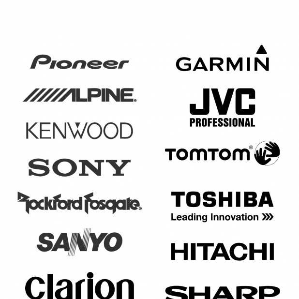
3. Check the Logo in Black and White
Always check your logo in black and white because if your logo does not look good in black and white, then you won’t be able to use it in advertisements where colorful ads are not permitted.
It is recommended to start the design of your logo in black and white because it will help you to solely focus on the design.
Black and White logos are monochrome versions of your colored logo. Have a look at the below set of logos to get an idea:
A Black and White logo is useful in many cases:
- When you are using the logo for 3D printing or textile printing.
- While scanning or faxing a monochrome version is preferred because it doesn’t fade out.
- When you are partnering with other companies, they might ask for a monochrome version of your logo instead of a colored one.
4. Follow a Minimalistic Approach
Minimalistic design refers to a design where the work is reduced to its necessary elements by maximizing simplicity and capitalizing on space. Adopting a minimalistic design makes your brand stand apart from your competitors who might have clunky and gaudy designs in their logo.
Here is an old logo for Ford Motors in the early 1990’s. At that time, logo design was nothing but the brand name in fancy fonts.

But, as time passed, Ford adopted a minimalistic style and revamped its logo. Here is Ford’s new logo which was designed in 2003.

Here are some tips to create a minimalistic logo:
- Stick to a geometric shape since these are the most recognizable. You can start your logo with a circle, square or a rectangle and then add more elements to it.
- Try and design your logo with a pencil in one go without stopping. If you can do it, the design will be 100% minimal.
- Keep the design simple and make sure your logo gets identified at a glance.
- Embrace efficiency and don’t be afraid to break the rules.
- Explore the depth of symbolism with your design. You can opt for an object and the things associated with the subject.
- I recommend using a minimum of 1-3 fonts to keep your design to minimum.
5. Harness the Power of Color Psychology
Color plays a key role in logo design. Colors help to convey messages and evoke emotions. A brand gains visibility and recognition by the choice of colors it uses in its logo.
Here are some of the main colors and their meaning in logo design:
- Red – Raises the energy level and conveys excitement.
- Orange – Depicts confidence and youthfulness.
- Yellow – Conveys optimism, clarity and warmth.
- Blue – Conveys trust and dependability.
- Green – Depicts peace, growth and health.
- Purple – Depicts creativity and imagination.
6. Keep an Eye on The Font
You definitely want your logo to be easily readable. A tough to read logo will be unable to reach the masses. This is where a good font comes into play. A font is one of the most crucial elements of your entire business identity.
Here are some of the important font types:
Serif: These fonts are easier to read and are often used by male dominated products.
Sans-Serif: These fonts are extremely simple and are associated with practicality.
Script: These are elegant, formal and stylish. These pair well with both Serif and Sans Serif.
Slab Serif: These are bold and trendy and pair well with Sans Serif.
Here are some tips to choose the best font for your logo:
- Keep it simple, clean and elegant.
- Analyze your competitors and choose a font that reflects your brand identity.
- Always take into account your product and service and choose a font that perfectly fits your niche.
- Do not use too many fonts. One or two top fonts should be your preferred choice.
Conclusion
The startup culture is moving quickly and a professional logo is what your business needs. Always remember the top 6 things as discussed in this article and you won’t go wrong with your logo design.


