With emerging new trends like the cleverly constructed infographic it may be hard not to get lost in all that is going on, but a new trend might help you channel your focus, or rather lack thereof, elsewhere. The trend I speak of is the act of creating blurred backgrounds.
Don’t get me wrong blurred backgrounds have been around for some time, especially when it comes to photography and film. Now it seems to be making a splash, albeit an out of focus and fuzzy one, in the design community. If you’ve been looking, you may have already seen this concept used in landing pages and other design related artworks. In this post, we will share some insights on the blurred background phenomenon in the design world.
Where
We’ve already had the ever so popular bokeh trend that is still popular in web design. So, where is this blurred background trend appearing?
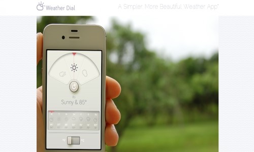
Well a lot of times you will come upon blurred backgrounds being used in landing pages and websites geared towards web and mobile apps. As this designing trend is becoming increasingly popular, you might have already seen it branching out to non app related websites.
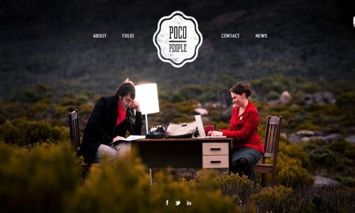
Blurred background use is popping up in printed media such as flyers and other related promotional usage, including business cards. Designers are even using these types of backgrounds for their own personal portfolios while businesses like Square are even using them for their own site. Even Twitter is getting in on the action with the customization of your twitter header, so chances are you have probably already seen this trend somewhere.
Why
The first thing you may be wondering is “why in the world would anyone want to blur anything out in their design?” Well truthfully there are many reasons why a person would choose to blur out elements in their designs. Some immediate reasons that come to mind is to use it as some form of censorship, to make some type of point and to create interest, but generally the main reason to blur out anything in your design is to shift focus from one element to another.
Unfortunately, using all your skills and tricks from your design bag can sometimes overpopulate your final project, leaving it messy and muddled. To save oneself from the dreaded redesign a designer can easily blur out certain aspects of the design giving the elements a subtle look without having to sacrifice those added bits that really make the design work. Using blurred backgrounds helps lead the eyes of your site’s visitors. In other words having a background that is out of focus keeps people looking at what really matters and keeps them from becoming overwhelmed.
How
There are several ways in which one might go about achieving a blurred background in their design.
If you’re a coding aficionado, there is certainly a way to create an effect that blurs the background when passed over by a mouse. This, however, might not be the most optimal thing to do to create a blurred background, but it will certainly give your website a cool effect. If you’re interested in such coding, tympanus.net offers a code that does almost the same thing as mentioned above, but instead the background blurs out when you mouse over an object versus the background itself.
If you prefer a more manual approach, you have two options of blurring. You can either create a full blurred out background or create selective focusing with blurring. Each technique can be created in Photoshop in under ten minutes.
A full blurred background can easily be created by opening your selected image in Photoshop and adding the Gaussian Blur filter to it. The radius amount or in other words, how strong you want the blur will depend on your personal preference. Utilizing a blur radius somewhere between 5px-10px should be enough, but once again it is all personal preference.
Selective focusing can be attained by creating something akin to the tilt shift method. This is a method often used in photography and is sometimes referred to as the fake miniature effect. Your method of choice will consequently depend on what look you are going for.


Want to create your own design with a blurred background? Here are some things you should think about before proceeding with your project.
Regulate Blurring: yes you do want to make sure that your background is blurred out, however you need to be mindful of the strength of the blur. Heavy blurs can leave visitors feeling disoriented and at times text can be hard to read.
Contrasting Colors: by now you should know that contrast between colors is extremely important when designing. Consider contrasting with dark and light colors. If you are using a dark blurred background, make sure your included elements are several shades lighter. This will make sure everything is legible and discernible.
Add Vignettes: you don’t have to stop at just blurring your background – try to make it unique. Adding a vignette to your background will give it a nice dramatic touch while still remaining subtle. You can also try adding bokeh to spice up your background.
Create Focus: try to create a main focus. Deciding your blurring technique is important in order to achieve the right look. Try using the tilt-shift effect if an all blur method doesn’t work for you.
Use Resources: if you have trouble finding an image that will work for your website or just don’t want to make your own, try scouring the web for already blurred backgrounds ready for your use.
Background Image: decide what image you want to use for your website. Your background can either be a photograph, illustration or abstract shapes and/or lights such as bokeh. Deciding what background will work best depends solely on preference.