The best kinds of websites are the ones that don’t call attention to all the work and time it takes to build them. UX, or user experience, describes all the things that happen on a website that make it pretty to look at and easy to use. Your website can have a positive UX or a negative UX – and your users may not even be able to explain what it is that works or doesn’t work.
One of the most important yet frequently overlooked facets of good UX is wise use of color. People underestimate the power of color choice to affect user mood and engagement. Colors – including different tones and shades – evoke different emotions and can dramatically influence the type of experience a user has with a website.
Designing UX Around User Expectations
Social conventions around certain colors and color combinations can seriously impact UX. Users may find a site responsive and quick to load multiple pages, but they still find the browsing experience off-putting due to the color scheme of the site. The wrong color scheme can be powerful and even increase your bounce rate.
Psychological factors may also influence how colors affect UX. Different colors carry different emotional connotations. It’s essential to craft experiences geared toward the target userbase, and this requires extensive research and a bit of experimentation. Though personal preference may play some role in UX, most people don’t even realize their psyches’ are affected by color.
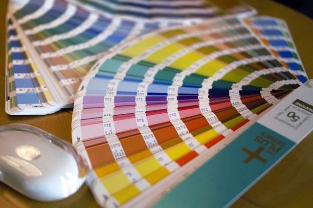
The Psychology Behind Color
If you want to capitalize on the psychology of colors for your UX design, think about the overall feelings that we connect with these shades.
- Red is commonly associated with danger, passion, and urgency. It can also convey strength, power, or even danger.
- Orange resonates with energy, vitality, and tends to convey positivity.
- Yellow conveys energy and youthfulness. Lighter yellows tend to evoke feelings of calm while darker, more saturated yellows might convey alertness and optimism.
- Green certainly carries symbolic connection to the natural world. Green also conveys wisdom, comfort, and wealth.
- Blue hues tend to convey authority and trustworthiness. They also tend to have a calming effect.
- Purple has strong ties to the concepts of luxury and royalty, but it can also convey peace, compassion, and spirituality.
- Pink tends to evoke different feelings depending on the saturation of the color. Lighter pinks may convey femininity, playfulness, and fun while darker pinks can convey sexual confidence or even sexual aggressiveness.
- Brown is a sturdy, reliable color. It tends to evoke feelings of hard work, earthiness, and security.
- Black can be a profoundly impactful color when used correctly, conveying feelings of sleekness, luxury, and professionalism. However, it can also have strong connections to depression, death, and silence when used in other ways.
- White is almost universally linked to concepts of cleanliness, purity, and clarity.
- Grey may carry negative connotations of sterility, coldness, or old age, but it can also convey independence and forward thinking.
Think of UX design as piecing together a puzzle – and colors are one piece. The colors you choose for your website may only be small pieces of that puzzle, but, if they look out of place with the rest of the elements of your site, they can easily throw off the balance of the entire UX and fail to create the type of experiences you want to convey.
Brand Recognition With Colors
When you think of Coca-Cola, the first color that probably pops into your mind is the trademark bright, saturated red of a can or bottle label. Seeing a Coca-Cola bottle printed in blue, yellow, or orange would probably jump out at you. Even if the beverage inside was exactly the same, the vast majority of consumers would likely assume that the color change signified a change in the product itself. People have come to associate the Coca-Cola brand with their trademark red, so Coca-Cola leverages this color association effectively in almost all of its branded marketing.
Brand identity is an essential consideration in any web design. You don’t have to change the colors of your logo to leverage best practices for UX. You just have to consider how to use those colors to your advantage in the digital landscape. It may mean lightening or darkening certain shades or not letting one color dominate. Coca-Cola’s website isn’t all red and white, but it does leverage red and white throughout its site. The banner is their traditional red with white font, but the website leverages many hues of blue and green – both colors that are calming but engaging.
UX designers must work closely with web developers and marketing teams to determine how colors resonate with their brand values as well as their customer base. For example, a younger audience will likely connect more with vibrant, youthful colors that convey energy and fun. An older audience would probably resonate more with more subdued and saturated colors that convey reliability and security.
Think about pink – it’s a great color for a brand that sells younger girls’ clothes, but change the shade and it will target the largest buying population with millennial pink.
User Patterns and Color Association
You may have noticed many websites, despite having very different main color palettes, tend to lean on the same types of colors for specific functions. For example, many websites use orange and red hues for their calls to action such as “Sign Up Now” and “Contact Us” because those colors convey urgency. People naturally connect those colors with taking action, so web designers leverage them accordingly with their UX design.
Colors can help users navigate a website more easily and intuitively. UX design teams can help explore the best ways to leverage color palettes while drawing users’ eyes. Colors should enhance and draw the eye to the most important elements of a website, such as navigational links to browse around the site, buttons for email signups and calls to action, and other opportunities to interact with the site.
A/B Testing Is Critical
One of the best ways to determine which colors will resonate the most with your target userbase is to develop different iterations of your site or different elements of your site using different colors. For example, you could try the same color palette for two different versions of the same page but change the call to action and signup buttons to different hues. You’ll likely notice that one converts much more than the other, and this experimentation can be invaluable as it informs your UX design process for the future.
Remember, it’s alright to step beyond your brand’s color palette for interactive buttons on your website. Your color palette may include blue, silver, and purple, but that does not mean you cannot make your signup button or the link to your contact page a bright orange or red to attract attention and increase conversions. Using a different shade of a color already within your brand’s color palette may become lost in the overall design of your site. Try using something more visually impactful if you want to draw the user’s eyes to the elements of your site that will lead to conversions.
Leverage Color Effectively in Your UX Design
Color is an extremely potent tool to improve UX. Think carefully about the types of experiences you wish users to have with your website and leverage those colors to improve their experiences. Capitalize on your brand’s color palette to create more memorable interactions with visitors to your website, track your results, and do not shy away from challenging yourself with experimentation to find the best ways to leverage color effectively for better UX and higher conversion rates.