No matter how or where you do business, you have likely heard that optimizing for mobile is essential to remaining competitive in the current business environment. The vast majority of people have a smart device and use them to make purchasing decisions on the go. In case you need further convincing:
- Globally, around 2/3rd of internet users accessed it using their mobile device.
- By 2020, there are projected to be 2.87 billion smartphone users.
- Around half of website traffic worldwide came from mobile devices in 2018.
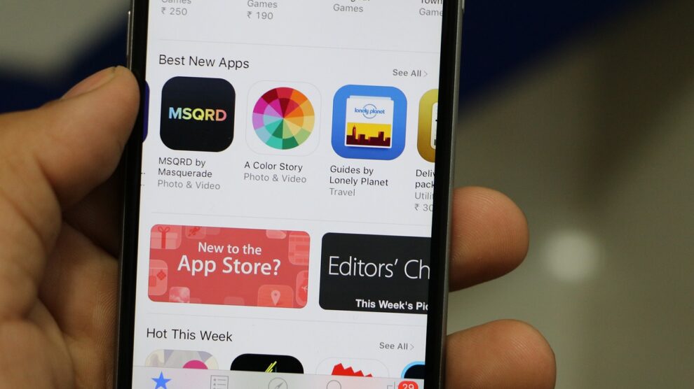
- In the first quarter of 2018, there were 187.1 billion app downloads.
- The iPhone X was the best selling smartphone of 2018, but Samsung dominates the most total mobile sales. Optimizing for the two dominant players – Apple and Android – is essential.
Obviously, mobile is and will continue to be an essential part of your enterprise. At the same time, there is a difference between simply optimizing for mobile and designing with a mobile first approach.
What Is “Mobile-First?”
To understand the importance of mobile first design, it is essential to know what the following terms mean:
Responsive Web Design (RWD). As the name implies, RWD involves using design methods that allow the user to have the same website experience no matter the screen they are using – a desktop computer, laptop, tablet, or smart device. A truly responsive website reduces a user’s need to zoom, pan, or scroll when using a website.
Progressive Advancement. When a web designer and developer make a website, they build a version for a lower browser – like a mobile site – with more basic functions and features. The more advanced versions apply to the tablet or PC and allow more space for interactive content and comprehensive effects (hence creating a better user experience compared to the mobile site).
Graceful Degradation. The opposite of progressive advancement, a website designer and developer start with the advanced version and then make the product compatible with mobile devices by adjusting some functions or content.
Understanding these definitions help you understand your next steps since these are the methods a web design and development team will use when designing company websites. Though RWD is still the most common method, the progressive advancement method is becoming more popular. Progressive advancement requires a mobile first approach, which naturally encourages designers to think of the functions that will be important to a mobile experience.
Mobile First and App Development
When desktop browsing was the norm for the internet and smartphone use was still in the early adoption phase, it made sense to design websites and applications for desktop in mind. It served as the primary source for web traffic and made the most sense for return on investment.
In the past few years, however, the tides have turned. Mobile now makes up more than half of all web traffic and is responsible for more sales. It’s no longer an option for the tech-savvy company, it’s a necessity for all companies who want to remain competitive. Consider that nearly two-thirds of all Google searches in 2019 were made from mobile devices. Mobile is the new normal, and it is essential that enterprises take the mobile first-approach to their app and website development. Here’s why.
It Helps Ensure Scalability
Working with a mobile device gives you a limited amount of space in which to provide a seamless user experience. It’s much easier to scale an application up to the desktop level than it is down to a mobile level. The reasoning behind this is simple: scaling down affects the functionality of the site on mobile, while scaling up to desktop does not. Scaling down is all about making sacrifices, scaling up is about working to do more with what you have. When you start from a mobile-first mindset, you make the mobile version as comprehensive as possible, so a user can navigate it seamlessly. A desktop or tablet version just leaves room for more interactive content and features.
It Helps Improve Your Back-End Systems
When you are working with a mobile first approach, it forces you to think beyond the app or website and into the back-end systems. The systems that apps connect to have certain development requirements, and designing mobile first ensures you don’t have to go through the hassle of making the app fit the development requirements after the fact (again, making sacrifices). Desktop websites and mobile applications have completely different usage patterns, which means there would be a lot more work involved in scaling backwards.
The traffic patterns of a mobile application are much less consistent than that on desktop. For example, you might experience huge peaks in traffic when someone shares some viral content on social media. All this means is that sophisticated back end systems are necessary. When designing with a mobile-first approach then, the development team can anticipate these kinds of challenges and work in the necessary infrastructure from the beginning, rather than trying to retrofit them later and potentially sacrificing performance.
It Forces You Think of the Needs of the User
Mobile-first considers the needs of the user and puts them into the application or mobile site. Since you have limited space to work with, you will spend a lot of time in the planning phase and thinking about what the user needs most from the experience. This triage approach is much more fruitful when working from mobile than it is trying to scale down from desktop, since you will naturally place more emphasis on usability within the constraints of the mobile environment.
It Requires You to Be Selective About Your Content
When you design with mobile in mind, you will have to be more deliberate and selective in the types of content you want to showcase on your website. When you use a graceful degradation approach, you are serving up all your content at the same time, which may include text, images, videos, audio, and even AR/VR. Scaling downward, developers will have to ignore or remove most of this content so it won’t gum up mobile performance. However, if it’s preloaded in, it could be slowing your download speeds.
A progressive advancement approach, however, starts with loading the bare necessities. When a user loads that site, they will experience better load times and a more enjoyable experience as a result. The additional content can be added on an as-needed basis and optimized so they perform well.
Your Organization Should Be Designing With Mobile First In Mind
Mobile is not a fad or a trend; it’s here to stay. The numbers speak for themselves: as adoption of mobile devices increases around the world, so does traffic and BYOD (bring your own device). We can reasonably expect for mobile traffic to account for the slim majority of all website traffic within the next few years. As such, designing websites and applications with mobile browsing in mind makes perfect sense.
Even from a layman’s perspective, it’s important to understand that mobile development is much different than that of a desktop. There are more restrictions, so design and development teams must work to make the most of the space.
In general, working to scale up rather than down is more successful in creating a seamless experience across all of a user’s devices. If you’re looking for a place to start when designing or developing a website, our recommendation would be to start with mobile first.