With so many people online these days it’s important to have a website that stands out from the rest. It’s all well and good paying for something that looks fancy and colourful, but if it’s not responsive, you could potentially lose a huge percentage of your audience…
Let’s face it, even your grandparents are using the internet now, and are actually becoming a large part of certain audiences, so your website needs to be accessible to everyone, everywhere, and on every device.
- What is a responsive website?
- Why is a responsive design so important?
- How to implement responsive design?
What is a Responsive Website?
The rise in use of mobile devices in our everyday lives means we’re now searching the internet on-the-go, all day long. How many times have you searched the internet on your phone but you’ve not been able to use your chosen site properly? This could be because it’s not had ‘responsiveness’ in mind when it was designed.
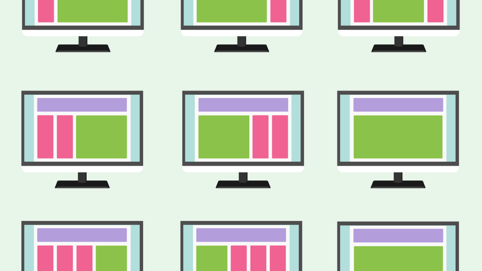
A responsive design consists of a flexible layout that enables a website to automatically adjust according to the screen size it is being viewed on. PC’s and laptops have landscape screens, however, we tend to view the internet on our phones, and some tablets, predominantly in portrait. This means you need to have a responsively designed website for phone users and PC users alike to ensure easy navigation.
Whoever creates your website needs to be able to take the initial design layout and make sure that it works for vertical and horizontal screens as well as for recommended screen size dimensions. Some images or uniquely shaped sections of your site, like CTA’s, could look great in landscape but won’t function or give the same effect in portrait. Working with open-source content management system platforms like Umbraco, are a great way to make sure this is completely taken care of.
It’s also important to note that ‘mobile-friendly’ sites don’t mean the same thing and aren’t always fully responsive. What looks good and works for an iPhone device, may not work or look the same on a Samsung tablet even though they’re both portrait.
Why is a Responsive Design So Important?
If your website doesn’t work on different screen types then there is a large chance that people won’t or can’t use your website. Think about it, if you don’t like a website – it doesn’t look right, you can’t click or tap on things – you go back to your search results and find a different site to give you what you want. Those who don’t have a desktop device and only use a mobile to surf the internet will straight away be lost to you if your site isn’t responsive and doesn’t work on mobiles.
Not only does this mean that you’ve lost traffic and increased your bounce rate, you’ve lost potential customers and therefore sales. A responsive website can result in better customer experiences and customer journeys which in turn can lead to a much higher conversion rate for your website.
With Google being the main search engine that people use, you have to play by its rules. Google decides how good or relevant your website is and therefore where to rank you on its’ results pages. And one of the larger positives of having a responsive design for your website is improved search engine rankings.
Responsiveness is one of Google’s determiners for their ranking system and if your website is not responsive, it will automatically be ranked lower than those that are – putting you further down the list than potentially less appropriate content just because your site isn’t responsive. So all that time you spent on SEO, keywords and meta descriptions will essentially be a waste of time.
How to Implement Responsive Design?
Responsive design can be condensed into 3 main sections – layout, media and typography – although there is a little more to it than that. Again, layout is important in terms of screen types and dimensions, you have to get these right to even show up properly on certain devices. And as previously mentioned, you must ensure certain sections of your design layout will still function and look right on other devices.
Media refers to the images and videos that you use on your website. If you don’t have any this won’t be a huge problem…but you should definitely have both videos and images on your website. These also need to be responsive, for example, on your PC that header image of a landscape mountainside against a dramatic starry night sky looks lovely, very eye-catching. However, on your portrait phone all you see is a zoomed in section of the middle of the mountainside and the wow-factor is lost. Make sure you’re using the right images at the right size that can look good in both landscape and portrait mode.
And lastly typography, font and font size should also be something you consider for your responsive design. It’s as simple as making sure the size of the font you’re using works on all device shapes and sizes – text can suddenly look very small when you haven’t resized it for mobile devices. And equally, you should check the font type itself is readable on all devices, if your user can’t read what you’re offering then they won’t become customers.


