Many times, patterns and correlations go unnoticed in large, text-based datasets, simply because they’re not immediately apparent. Data visualization is all about making it easier for people to understand the significance and meaning of data by translating information into a visual context. Data visualization software helps to present these patterns in a manner that’s easier to digest.
In the context of business intelligence, data visualization helps companies create a visual summary of data that key decision-makers can use to take action. Put simply, it enhances data processing and makes it easier to deal with complex information, quickly.
In this article, we’ll take a look at three different types of data visualization tools that you can add to your company’s business intelligence and analytics tech stack. We’ll highlight the need for each tool and discuss some solutions.
1. Executive Dashboards
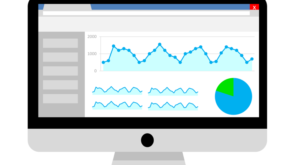
Companies of all shapes and sizes use dashboards for executive reporting. They’re great for giving performance snapshots, KPI overviews and summaries in a way that makes it super easy to spot results, patterns and trends.
In addition to this, dashboards can also be used to present dynamic data visualizations based on selected metrics.
Having the ability to visualize data allows your company leadership to make continuous improvements to your strategies and adapt to the changing landscape around you by measuring and building upon your success.
Here are some of the key features good executive dashboards should have:
- By definition, a dashboard should present all important information in a way that can be digested at a glance. For this reason, it should be intuitive and user-friendly, with a focus on clean design.
- The dashboard itself should let you create visual summaries of all important KPIs and trends, allowing you to see what matters, without distractions.
- Being able to customize the dashboard – ideally by using drag-and-drop widgets – is crucial. Your organization may need to monitor dozens of trends at any given time, so you should have the flexibility to pick and choose which trends appear where for each team or department.
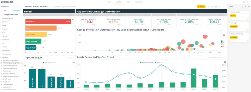
Sisense is a business intelligence software platform that helps companies build powerful visual dashboards and reports to present data, identify trends, and make informed data-driven decisions. Using Sisense, you’ll be able to visually represent data and share large datasets between teams in your organization in a clear and efficient way.
It lets you customize your dashboard layouts using drag-and-drop functionality so that you can arrange your data visualizations in any way you want. Sinsense’s interactive data visualizations help you make the most of many visualization styles, so you can find the best ways to present your KPIs visually.
You can also choose from a number of widgets and filters that help you generate insights from company data that may not be apparent in the first visualization.
These dashboard widgets include scatter plots to see correlations, gauges to measure KPIs, and line charts to determine trends, among others.
Sisense lets you fetch data from scores of data sources and perform data and predictive analysis to understand your company’s past performance and predict future trends.
You’ll be able to collaborate with different departments across your organization to share interactive visualizations, better manage data, and use filters to dive deeper into existing insights.
Some of the ready-to-use, industry-specific design templates offered by Sisense include SaaS, project management, manufacturing, human resources, and sales.
2. Infographics
Infographics are digital marketing assets that are used to educate and inform audiences in an engaging way. They can be used as lead magnets, link-bait to boost your SEO and social media share-friendly content to drive traffic to your website. You can use them to present results, simplify complex concepts, or make comparisons.
Data storytelling is a popular way to increase awareness and generate interest using infographics. It lets you clearly explain data through engaging graphics. Images, charts, icons, and design elements are great for easily communicating complex ideas by breaking them down and arranging them into visually pleasing, logical sequences.
Infographics in the form of data-based visualizations can help you inform and educate your target audience, simplify complex information, show poll and survey results, boast performance lift in case studies and present comparisons.
Here are some of the key features you need to consider when choosing an infographic tool:
- Built-in templates and galleries so you don’t have to start from scratch for each infographic you create.
- Team collaboration features so multiple team members can work on designing the infographic.
- The ability to import data from different sources such as spreadsheets.
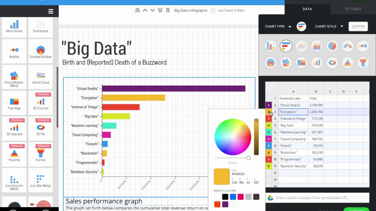
Venngage is a data visualization tool for creating infographics. Using Venngage, you’ll be able to create all sorts of marketing images based on data, including process infographics and comparison infographics (for comparing products, price points, or brands).
This way, you can use visuals to make even the most intricate process or concept easy to understand. The tool lets you use icons, charts, and mind maps to make concepts easier to follow or break down relationships.
Venngage also allows you to add and manage team members from your account. You’ll be able to easily share templates and infographics between team members to improve collaboration and simplify the workflow. Venngage has a built-in Gallery section that’s great for design inspiration and examples. You can find tons of ideas for including business infographics, educational infographics, tech infographics, and marketing infographics, to name a few.
With Venngage, you can quickly start creating professional visuals using pre-built templates. This way, you don’t have to design infographics from a blank canvas. It’s also worth mentioning that Venngage lets you import data directly from spreadsheets, including Google sheets.
3. Client Reports
Client reporting deals with presenting campaign performance and end results in the form of a static document. Client reports are usually cyclical and are shared and stored in different formats like PDFs, presentations, or email.
They play a key role in facilitating decision making related to key metrics your clients need like lead generation, site traffic, market analysis, brand analysis, advertising expenses, and social media growth.
Here are some of the key features you should look for in client reporting tools:
- The data visualization tool used should give you access to intuitive and interactive visuals that enable your clients to understand trends and glean insights. This way, they’ll be able to easily see the value of the services you provide.
- It should also allow you to sort, filter, and move variables to help you present the metrics that matter most.
- Choose a data visualization tool that lets you combine multiple datasets to generate insightful reports as well as view reports in different formats.
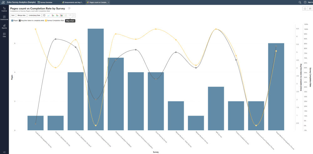
Zoho Analytics is a cloud-based reporting and analytics tool that enables you to create client reports using a drag-and-drop based designer. It comes with a number of data visualization tools to help you get down to specifics.
This powerful visualization tool gives you access to a variety of reporting options including charts, pivot tables, summary view, and tabular view. This way, you’ll have multiple options to represent your data, perform analysis, interpret data, and present your findings in the best way possible.
Zoho Analytics lets you import data stored in tabular formats such as CSV, XLS, HTML, JSON, and OData files to your system or from the web.
You can also import data stored on different cloud storage or drive platforms like Zoho WorkDrive, Zoho Docs, Dropbox, Google Drive, Amazon S3, and OneDrive to perform advanced reporting and analysis.
Using Zoho Analytics, you’ll be able to analyze data from dozens of popular business applications by connecting them with Zoho to generate advanced reports and perform analysis. These apps include Salesforce CRM, Microsoft Dynamics CRM, HubSpot CRM, Google Analytics, Stripe, and Bing Ads.
Conclusion
Data visualization tools help you process, understand, and manage data easily and efficiently. They’re great for uncovering and conveying trends and patterns from complex datasets that might otherwise be overlooked or simply difficult to derive meaning from.
To recap:
- Executive dashboards allow you to visualize dynamic data based on selected KPIs. This helps senior decision-makers measure company performance and improve interdepartmental communication.
- Infographics are powerful marketing assets that enable you to reach out to your target audience, attract new leads for your business, and simplify complex concepts and processes.
- Client reports help organizations convey campaign performance and end results in a clear and transparent way, to help ensure customer loyalty.